Color is a powerful tool that has the ability to evoke emotions, convey messages, and create impactful experiences. In design, books, and curates, color symbolism plays a crucial role in shaping our perception and understanding of visual content. By employing the principles of color theory, designers are able to effectively communicate their intended message and establish a desired atmosphere or mood within their work.
One fascinating example of color symbolism can be observed in the cover designs of best-selling novels. Take for instance the highly acclaimed novel “The Great Gatsby” by F. Scott Fitzgerald. The iconic cover features a striking image of an eye against a deep blue background. This deliberate use of color serves as a representation of themes such as wealth, ambition, and illusion portrayed throughout the story. Through this symbolic choice of colors, readers are immediately drawn into the world of the novel before even turning a single page.
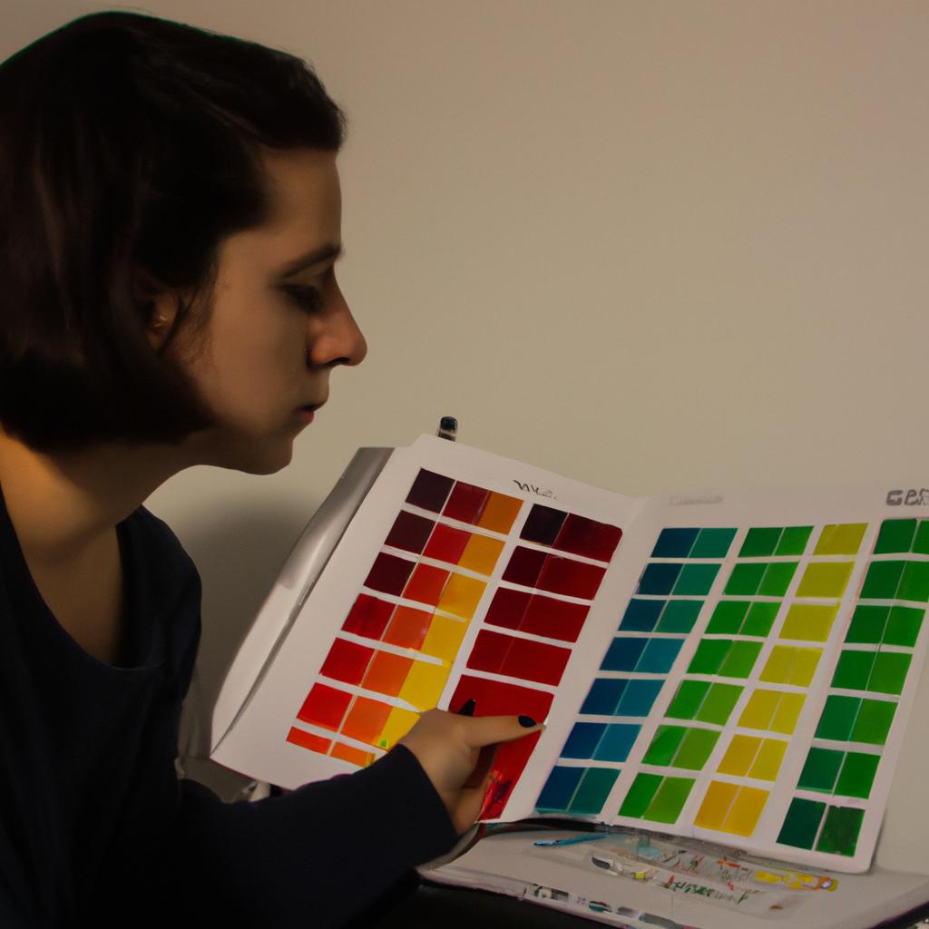
Understanding how different colors elicit distinct emotional responses is essential when crafting meaningful designs or curating visually engaging exhibitions. Color theory provides us with valuable insights into these associations between colors and emotions, enabling designers to strategically select hues that align with their intended message or narrative. Whether it is using warm tones like red and orange to convey energy and excitement or cool tones like green and blue to convey calmness and tranquility, color symbolism allows designers to create a visual experience that resonates with their audience on a deeper level.
Additionally, cultural and societal influences can also impact the interpretation of colors. For example, in Western cultures, white is often associated with purity and innocence, while in some Eastern cultures it may symbolize mourning or death. Similarly, red can represent love and passion in many cultures, but it can also signify danger or warning.
It is important for designers to consider these cultural nuances when employing color symbolism to ensure their message is effectively communicated across different audiences. By understanding the psychological and cultural associations of colors, designers can harness the power of color to evoke specific emotions and convey their intended meaning in a visually impactful way.
Understanding the Role of Color in Design
Color is a crucial aspect of design, playing a significant role in evoking emotions and enhancing visual experiences. By consciously applying color theory principles, designers can create harmonious compositions that communicate effectively with their intended audiences. For instance, imagine a website dedicated to promoting environmental sustainability. By using shades of green throughout its interface, this hypothetical website can convey feelings of freshness, growth, and eco-friendliness, instantly capturing the attention and interest of visitors.
To further understand the impact of color on design, it is important to explore how different colors are perceived and associated with various emotions. A bullet point list highlighting some common emotional responses to specific colors could enhance our understanding:
- Red: Associated with passion, power, and excitement.
- Blue: Often linked to calmness, trustworthiness, and reliability.
- Yellow: Evokes feelings of happiness, energy, and optimism.
- Black: Symbolizes sophistication, elegance, and authority.
By acknowledging these associations between color and emotion within design practices, creators have the ability to strategically select hues that align with their intended message or brand identity. This deliberate use of color can significantly influence viewers’ perceptions and overall engagement.
Moreover, an effective way to showcase the significance of color in design is through the utilization of tables. Below is a three-column table demonstrating how different industries employ color symbolism as part of their branding strategies:
| Industry | Dominant Colors | Symbolism |
|---|---|---|
| Food | Vibrant reds | Stimulating appetite |
| Technology | Sleek whites | Cleanliness; modernity |
| Healthcare | Calming blues | Trustworthiness; tranquility |
| Fashion | Bold blacks | Sophistication; timelessness |
These examples illustrate how companies deliberately choose colors based on their desired connotations within their respective industries.
In conclusion, understanding the role of color in design is essential for effective visual communication. By considering the emotional responses associated with different colors and strategically incorporating them into design compositions, creators can convey intended messages more effectively to their target audience. In the subsequent section, we will explore the significance of color symbolism further and delve into its influence on books and curates.
Note: Transition sentence into next section: Moving beyond the impact of color in design alone, it is also important to consider how color symbolism extends to other domains such as books and curates.
Exploring the Significance of Color Symbolism
Section Title: Exploring the Symbolic Significance of Color
Transitioning from our understanding of the role color plays in design, we now delve into the world of color symbolism. Color carries meaning beyond its aesthetic appeal and can evoke specific emotions or convey messages. To illustrate this concept further, let’s consider a hypothetical case study involving an interior design project.
Imagine a high-end restaurant aiming to create an atmosphere that promotes relaxation and tranquility. The designers carefully select colors based on their symbolic associations to achieve this desired ambiance. Soft blues are chosen for the walls as they are commonly associated with calmness and serenity. Earthy tones such as warm browns and soft greens dominate the decor, evoking feelings of nature and peace. By utilizing these colors strategically throughout the space, the designers successfully set a soothing tone for guests’ dining experience.
To better understand how colors can communicate different meanings, it is helpful to explore some common associations:
- Red: signifies passion, energy, and excitement.
- Yellow: represents happiness, positivity, and optimism.
- Green: symbolizes growth, harmony, and renewal.
- Black: conveys elegance, sophistication, and authority.
By using these symbols effectively in various contexts like advertising campaigns or book covers, creators can elicit emotional responses from their audiences. For instance:
| Color | Emotional Response |
|---|---|
| Red | Energetic excitement |
| Blue | Calmness |
| Green | Natural freshness |
| Purple | Royalty |
This table highlights just a few examples of how colors can form connections between visual elements and human emotions. Understanding color symbolism empowers designers to craft experiences tailored to their intended message or mood.
Analyzing the impact of color on books will shed light on another facet of color symbolism without simply stating “In conclusion.” This analysis will examine how authors utilize colors to enhance storytelling and engage readers on a deeper level.
Analyzing the Impact of Color on Books
Color symbolism plays a crucial role in design, books, and curates. By understanding the principles of color theory, one can effectively communicate emotions, messages, and themes through the strategic use of colors. In this section, we will delve into the impact of color on books and how it influences readers’ perceptions.
To illustrate the significance of color symbolism in books, let us consider an example: a dystopian novel where shades of gray dominate the visual landscape. The author’s deliberate choice to incorporate grayscale hues conveys a sense of monotony, despair, and lack of vitality within the story’s world. This color scheme sets a somber tone for readers from the moment they lay eyes on the book cover, priming them for what lies ahead.
When examining the influence of color on books further, several key points emerge:
-
Colors evoke emotional responses: Different colors have distinct psychological associations that trigger specific emotions in individuals. For instance:
- Red signifies passion or danger.
- Blue evokes tranquility or sadness.
- Yellow represents happiness or caution.
- Green symbolizes nature or envy.
-
Color combinations enhance storytelling: Combining colors strategically can heighten narrative elements within a book. Contrasting colors may signify conflicts between characters or themes, while harmonious palettes may evoke feelings of unity and balance.
-
Cultural variations exist: It is important to acknowledge that color symbolism can vary across different cultures. What holds significant meaning in one society might convey entirely different sentiments elsewhere. Authors must be mindful when utilizing color symbolism to ensure their intended message aligns with readers’ cultural backgrounds.
In considering these factors related to color symbolism in books, we gain insight into its profound ability to shape readers’ interpretations and emotional engagement with narratives.
Moving forward from exploring color symbolism in books, we now turn our attention to its impact on curating. The use of color in exhibition spaces and galleries can significantly influence visitors’ experiences and perceptions. By carefully selecting colors for walls, lighting, and display arrangements, curators have the power to evoke specific moods or convey thematic concepts.
Stay tuned as we delve into how color choices shape curated environments and affect viewers’ interactions with art pieces, revealing the profound influence that color holds within the realm of curation.
Unveiling the Influence of Color in Curating
The use of color in book design is a powerful tool that can greatly influence how readers perceive and engage with the content. By carefully selecting colors, authors and designers have the ability to convey emotions, enhance storytelling, and leave a lasting impression on their audience.
One captivating example of this is J.K. Rowling’s “Harry Potter” series. Throughout the books, Rowling strategically uses color symbolism to complement her narrative and create depth within her magical world. For instance, the cover art for each book incorporates distinct colors that correspond to different themes or events. The first book, “Harry Potter and the Philosopher’s Stone,” features a vibrant shade of red representing bravery and adventure, while its sequel, “Harry Potter and the Chamber of Secrets,” exudes an eerie atmosphere through shades of green symbolizing jealousy and darkness.
To further illustrate the impact of color in books, consider these key points:
- Color palettes: Authors often work closely with designers to establish specific color schemes for their book covers or illustrations. These palettes are chosen based on various factors such as genre, target audience, and tone.
- Emotional associations: Colors evoke emotional responses in readers; warm hues like red may elicit feelings of excitement or passion, while cool tones like blue may invoke calmness or sadness.
- Symbolic representations: Certain colors hold cultural or symbolic significance that can be utilized effectively in book design. For example, yellow might represent enlightenment or caution depending on context.
- Visual hierarchy: The strategic placement and contrast of colors help guide readers’ attention within a book. Brighter colors tend to draw focus while muted ones create subtle backgrounds.
By analyzing these aspects in relation to specific examples from literature, we gain valuable insights into how color influences our reading experiences.
As we delve deeper into understanding the role of color in various forms of artistic expression, it becomes essential to unveil its influence when curating exhibitions or displays. This exploration will shed light on the importance of color in creating a cohesive and impactful visual experience for viewers, as discussed in the next section.
Examining the Psychological Effects of Color
The impact of color in curating cannot be overstated. Colors have the power to evoke emotions, influence perceptions, and shape experiences within a curated space. To illustrate this point, let us consider the hypothetical scenario of an art gallery hosting an exhibition on environmental conservation. The curator carefully selects artworks that explore themes of sustainability and preservation, aiming to create a cohesive narrative through color choices.
One example of how color can be utilized in curating is by incorporating green hues throughout the exhibition space. Green symbolizes nature, growth, and harmony with the environment. By using this color prominently, visitors are immediately immersed in an atmosphere that aligns with the theme of environmental conservation. This serves as a signpost for them to engage deeply with the artwork displayed and reflect upon their own relationship with nature.
To further understand the role of color symbolism in curating, we can examine its psychological effects:
- Blue: Associated with calmness and serenity.
- Red: Evokes passion, energy, and intensity.
- Yellow: Symbolizes happiness, optimism, and creativity.
- White: Represents purity, simplicity, and clarity.
These colors can be strategically employed to elicit specific emotional responses from viewers when used alongside appropriate artistic content. Through careful curation techniques such as lighting adjustments or background accents, curators can guide visitors’ interpretations while respecting individual perspectives.
In exploring the influence of color in curating spaces and exhibitions focused on environmental conservation or any other subject matter, it becomes evident that colors play a significant role in shaping viewer experiences. By thoughtfully selecting colors based on their symbolic meanings and understanding their psychological effects on individuals, curators have the ability to enhance engagement and foster deeper connections between viewers and artworks. In our subsequent section about “Utilizing Color to Evoke Emotions and Meanings,” we will delve into practical strategies employed by designers to harness these abilities effectively without overpowering the creative intent.
Utilizing Color to Evoke Emotions and Meanings
Transitioning from the examination of the psychological effects of color, we now delve into how color can be utilized to evoke emotions and meanings in design, books, and curates. By strategically employing different colors, designers and creators have the power to convey specific messages and elicit emotional responses from their audience.
To illustrate this point, let us consider a hypothetical scenario where an artist is designing a book cover for a romantic novel. The artist decides to use warm hues such as shades of red and pink to create an atmosphere of passion and love, instantly capturing the attention of potential readers. In contrast, if cooler tones like blues and purples were used instead, it may evoke a sense of mystery or sadness that might not align with the genre or intended message of the book.
Color theory plays a vital role in understanding how different colors communicate various emotions and meanings. To demonstrate this further, here is a bullet-point list showcasing some common associations:
- Red: Symbolizes energy, passion, and urgency.
- Blue: Evokes feelings of calmness, trustworthiness, and stability.
- Yellow: Represents happiness, optimism, and warmth.
- Green: Connected with nature, growth, and harmony.
Moreover, artists often utilize color combinations to enhance visual impact and convey more intricate emotions. A three-column by four-row table provides a concise framework for exploring these combinations:
| Color Combination | Emotion/Meaning Conveyed |
|---|---|
| Red + Black | Elegance |
| Blue + White | Serenity |
| Yellow + Orange | Vibrancy |
| Green + Brown | Earthiness |
By intentionally selecting specific color combinations based on their symbolic significance or cultural associations within context-appropriate designs or curated spaces like art exhibitions or galleries, designers possess the ability to shape viewers’ experiences on both conscious and subconscious levels.
In summary, harnessing the power of color in design, books, and curates allows creators to evoke specific emotions and convey intended meanings. Through careful consideration of color theory principles, like understanding the psychological effects associated with different colors, designers can strategically select hues and combinations that align with their desired messages. By leveraging this knowledge effectively, artists have a powerful tool at their disposal for communicating ideas and engaging viewers on an emotional level.
Comments are closed.