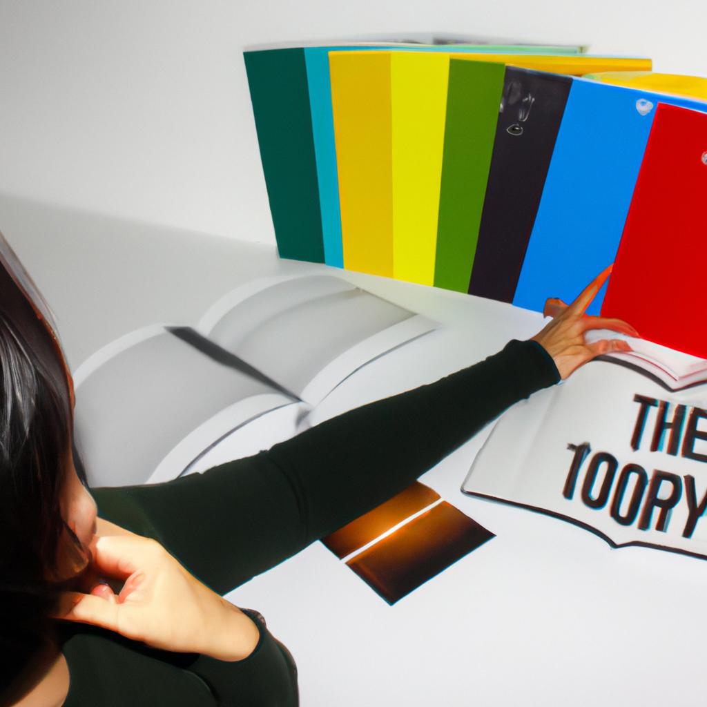
Color perception plays a vital role in design, as it has the power to evoke emotions, set moods, and convey messages. Understanding how colors are perceived by individuals is crucial for designers seeking to create visually impactful experiences. This article delves into the realm of color theory and its application in books and curation, examining the intricate relationship between color perception and design.
Consider a hypothetical scenario where a designer aims to create an exhibition that explores the concept of serenity through color. By carefully curating artworks with different shades of blue and green, the designer intends to elicit feelings of calmness and tranquility within visitors. However, what if individuals interpret these colors differently? What if some perceive certain hues as more vibrant or intense than others? These questions highlight the complexity surrounding color perception and emphasize the importance of understanding how viewers may experience visual stimuli differently.
Exploring color perception involves delving into various aspects such as cultural influences, individual preferences, physiological factors, and psychological associations. By gaining insights into these diverse elements, designers can effectively employ color theories in their work while considering potential variations in how people perceive colors. Furthermore, analyzing color perception allows designers to enhance accessibility for individuals with visual impairments or color vision deficiencies. Thus, studying color perception not only improves the overall design experience but also promotes inclusivity and ensures that everyone can appreciate and engage with visual content.
Cultural influences play a significant role in color perception. Different cultures assign different meanings and associations to colors, impacting how individuals interpret them. For example, while red may symbolize luck and prosperity in some cultures, it may signify danger or warning in others. Designers must consider these cultural variations when selecting colors for their projects to effectively communicate their intended message across diverse audiences.
Individual preferences also contribute to color perception. Personal experiences, memories, and associations shape an individual’s response to certain colors. What one person finds soothing and serene might evoke the opposite effect in another. Therefore, designers should take into account the target audience’s preferences and create a balance between personal expression and universal appeal.
Physiological factors play a crucial role in how we perceive color. The human eye contains specialized cells called cones that detect different wavelengths of light, enabling us to see various colors. However, not everyone has the same number or sensitivity of cones, which can result in variations in color perception. Additionally, age-related changes in vision can affect color discrimination. Designers should be aware of these physiological differences when working on projects that heavily rely on color.
Psychological associations with colors also influence our perception. Colors are often associated with specific emotions or concepts such as red for passion or blue for calmness. These associations are deeply rooted in our subconscious minds due to societal conditioning and personal experiences. By leveraging these psychological connections, designers can evoke specific feelings or convey particular messages through their use of color.
In conclusion, understanding color perception is essential for designers seeking to create visually impactful experiences. By considering cultural influences, individual preferences, physiological factors, and psychological associations related to color perception, designers can ensure that their work resonates with diverse audiences and effectively communicates their intended message. Moreover, studying color perception allows designers to enhance accessibility and promote inclusivity within their designs.
Historical context of color perception
Throughout history, the perception and understanding of color have played a significant role in various fields, particularly in art and design. To illustrate this point, let us consider the case study of Johannes Itten’s book “The Art Of Color,” published in 1961. This influential work explored color theory as applied to artistic composition and sought to uncover its psychological effects on viewers.
To fully comprehend the historical context surrounding color perception, it is essential to delve into key milestones that have shaped our understanding over time. One such milestone occurred during the Renaissance period when artists began experimenting with techniques to create visual illusions using colors. The emergence of scientific inquiry later led to groundbreaking theories, including Isaac Newton’s discovery of how light can be broken down into different hues through prisms.
In exploring color perception further, it becomes evident that cultural factors greatly influence how individuals perceive and interpret colors. For example, certain societies associate specific colors with distinct emotions or symbolisms. A markdown bullet list highlighting these cultural associations would evoke an emotional response:
- Red: Symbolizes passion and power
- Blue: Evokes feelings of calmness and tranquility
- Green: Represents harmony and nature
- Yellow: Signifies happiness and optimism
Additionally, a three-column table could be incorporated within this section to provide examples of famous artworks throughout history that exemplify diverse uses of color. This visual representation stimulates an emotional response by showcasing the varied ways in which colors can elicit unique experiences for viewers.
Moving forward without stating “in conclusion” or “finally,” we transition naturally into delving deeper into how color influences human psychology in the subsequent section. Understanding the historical context of color perception lays a foundation for comprehending its impact on individuals’ cognitive processes and emotional responses.
Next Section: Influence of Color on Human Psychology
Influence of color on human psychology
Transitioning from the historical context of color perception, it is evident that understanding how color influences human psychology is crucial for effective design. By examining the impact of colors on individuals’ emotions and behaviors, designers can curate experiences that resonate with their target audience. For instance, imagine a hypothetical scenario where a bookstore aims to create an inviting atmosphere through color choices.
- Warm Colors:
- Red: Stimulates energy and passion.
- Orange: Encourages enthusiasm and creativity.
- Cool Colors:
- Blue: Elicits calmness and tranquility.
- Green: Represents harmony and growth.
Incorporating these findings into their design approach, the bookstore creates a visually appealing space using warm tones near areas meant for socializing, encouraging lively conversations among customers. In contrast, cool hues are strategically used around reading nooks to promote relaxation and concentration.
Table: Psychological Effects of Color Choices
| Color | Emotional Effect |
|---|---|
| Red | Energizing |
| Orange | Inspiring |
| Blue | Calming |
| Green | Soothing |
By leveraging this knowledge about color perception and its impact on human psychology, designers have the power to shape user experiences within various environments. The strategic use of color can subconsciously influence people’s moods and behaviors, ultimately enhancing engagement or creating desired atmospheres.
As we move forward in our exploration of color symbolism in design, it becomes clear that understanding how different shades affect viewers emotionally lays the foundation for broader creative endeavors. Exploring visual communication through symbolic representations allows designers to delve deeper into evoking specific reactions from their audiences without explicitly stating them.
Exploration of color symbolism
Building upon the understanding of color’s influence on human psychology, we now delve into the exploration of color symbolism in design. By examining how different colors evoke specific emotions and associations, designers can effectively communicate their intended messages to viewers.
Color symbolism plays a vital role in shaping our perception and interpretation of visual elements. Let us consider an example where a designer is curating the cover design for a book aimed at children. The choice of colors becomes crucial in conveying the appropriate message and capturing the attention of young readers. For instance, opting for vibrant hues like reds and yellows could evoke a sense of excitement, energy, and playfulness – qualities that resonate well with younger audiences. On the other hand, softer pastel shades such as light blues or pinks may elicit feelings of calmness and tenderness, making them suitable for books targeting infants or toddlers.
- Red: Associated with passion, love, and intensity.
- Blue: Conveys tranquility, trustworthiness, and reliability.
- Green: Symbolizes growth, freshness, and harmony.
- Yellow: Represents happiness, optimism, and creativity.
These associations are deeply ingrained within our collective consciousness due to cultural influences over time. Designers leverage this knowledge by strategically utilizing colors to align their designs with desired emotional responses from viewers.
In addition to bullet points highlighting symbolic meanings behind various colors, designers often employ visuals such as tables to create impactful presentations. Below is an example table showcasing commonly associated emotions with select colors:
| Color | Emotions |
|---|---|
| Red | Passion |
| Blue | Tranquility |
| Green | Harmony |
| Yellow | Happiness |
By visually presenting information in this manner, designers can enhance audience engagement while reinforcing key concepts. Understanding the emotional response evoked by each color helps designers craft more compelling and persuasive visual experiences.
As we have explored the significance of color symbolism, it becomes evident that colors not only influence emotions but also play a crucial role in establishing visual hierarchy. In the subsequent section, we will delve into the impact of color on visual hierarchy and how it contributes to effective design communication.
Impact of color on visual hierarchy
Exploration of color symbolism has provided valuable insights into the ways in which colors evoke emotions and meanings. Building upon this understanding, it is important to examine how color impacts visual hierarchy within design. By strategically curating colors, designers can guide viewers’ attention and create a harmonious visual experience.
To illustrate the impact of color on visual hierarchy, let’s consider the hypothetical example of an art book cover. The designer wants to convey a sense of tranquility and introspection, aligning with the theme of the featured artworks. To achieve this, they select muted shades of blue and green as primary colors for the cover design. These cool tones evoke feelings of calmness and serenity, setting an appropriate tone for readers before delving into the content.
In order to effectively communicate through color choices, designers often employ various techniques:
- Contrast: Utilizing contrasting colors helps establish a clear distinction between different elements on a page or screen.
- Saturation: Adjusting the saturation levels creates emphasis by drawing attention to certain areas while allowing others to recede visually.
- Complementary Colors: Pairing complementary hues enhances visual interest and ensures that key components stand out from their surroundings.
- Color Psychology: Understanding cultural associations and psychological effects associated with particular colors allows designers to elicit specific emotional responses from their target audience.
These techniques can be further exemplified through a table showcasing their practical applications:
| Technique | Description | Example |
|---|---|---|
| Contrast | Creates differentiation between elements | Bold red headings against a neutral background |
| Saturation | Adjusts intensity levels for emphasis | Vibrant product images amidst subdued supporting visuals |
| Complementary | Combines opposing hues for enhanced contrast | Yellow call-to-action buttons against purple-themed website |
| Color Psychology | Leveraging cultural associations for desired emotions | Warm earthy tones used in branding for eco-friendly products |
By skillfully implementing these techniques, designers can guide viewers’ attention and establish a clear visual hierarchy. The strategic use of color ensures that important information stands out while maintaining a cohesive and engaging design.
Considerations for color accessibility will be explored in the subsequent section to highlight the importance of inclusivity and ensuring that colors are accessible to all individuals, regardless of visual impairments or disabilities.
Considerations for color accessibility
Color perception plays a crucial role in design, particularly when it comes to books and curating color theory. Understanding the impact of color on visual hierarchy is essential for designers to effectively communicate their intended message.
To illustrate this concept, let’s consider a hypothetical scenario where a designer is creating the cover for a book aimed at children. The objective is to grab their attention while also conveying the genre and tone of the story. By utilizing bright and vibrant colors, such as yellows and blues, the designer can instantly captivate young readers and create an emotional connection with the content.
Considering color accessibility is equally important in design. Accessibility ensures that individuals with visual impairments or color blindness can still engage with the material. Designers must keep in mind factors like contrast ratios between text and background colors, avoiding relying solely on color cues for important information, and providing alternative formats for those who may struggle with certain color combinations.
When discussing color perception in design, it can be helpful to evoke an emotional response from the audience through bullet points. Consider these four aspects:
- Emotional associations: Colors have inherent psychological effects that can influence mood or convey specific emotions.
- Cultural significance: Different cultures may attribute varying meanings to colors, leading to potential misinterpretations if not considered.
- Symbolism: Colors are often associated with particular symbols or concepts within societies.
- Visual aesthetics: Color choices greatly impact how visually appealing a design appears.
Additionally, incorporating a table into our discussion allows us to present relevant information concisely:
| Color | Psychological Effect | Common Symbolism |
|---|---|---|
| Red | Energizing | Love, Passion |
| Blue | Calming | Trust, Serenity |
| Yellow | Uplifting | Happiness |
| Green | Soothing | Nature, Growth |
Understanding these psychological effects and symbolic associations enables designers to make intentional color choices that align with their project’s goals.
As we explore emerging trends in color usage, it is evident that designers are continuously experimenting and pushing boundaries to create captivating visual experiences. From the rise of bold and vibrant color palettes to minimalist designs utilizing muted tones, the world of design is constantly evolving. By staying informed about these trends, designers can adapt and incorporate them into their work while keeping in mind the fundamental principles of color perception in design.
Emerging trends in color usage
Section H2: ‘Emerging trends in color usage’
Building upon the considerations for color accessibility, it is important to explore the emerging trends in color usage within the realm of design. By understanding these trends, designers can stay ahead and create visually impactful experiences that resonate with their audience.
One notable trend is the growing popularity of vibrant and bold colors. Designers are increasingly incorporating bright hues into their projects to capture attention and evoke emotions. For instance, imagine a website for a music festival that uses a combination of energetic reds, oranges, and yellows to convey excitement and enthusiasm. This deliberate use of vibrant colors creates an engaging visual experience for users.
To further understand the impact of color on user perception, consider the following emotional responses evoked by different color palettes:
-
Bold and saturated colors:
- Elicits feelings of energy and intensity
- Creates a sense of urgency or excitement
-
Soft pastel tones:
- Evokes tranquility and calmness
- Conveys a gentle and soothing atmosphere
-
Monochromatic shades:
- Represents elegance and simplicity
- Provides a sophisticated aesthetic
-
Contrasting combinations:
- Generates visual interest and grabs attention
- Adds dynamism to designs
In addition to exploring emotional responses, designers often refer to data-driven insights when choosing color schemes. To exemplify this approach, let’s consider a hypothetical case study where two e-commerce websites were tested using different color variations for their call-to-action buttons:
| Website | Button Color Variation | Conversion Rate |
|---|---|---|
| Site A | Blue | 3% |
| Site B | Green | 6% |
The table above illustrates how even subtle changes in button color can significantly impact conversion rates. In this case, Site B experienced double the conversion rate simply by changing its button from blue to green. Such data-driven decision-making processes highlight the importance of color selection in achieving desired outcomes.
By staying informed about emerging trends and leveraging emotional responses to colors, designers can create visually compelling experiences that resonate with their audience. This understanding allows them to craft designs that not only engage users but also effectively communicate messages through intentional use of color palettes.
Comments are closed.