Whitespace: The Key to Design: Books, Curates, Layout
In the world of design, there exists a powerful yet often overlooked element that can greatly impact the effectiveness and aesthetics of visual compositions. This element is known as whitespace, also referred to as negative space or breathing room. Whitespace refers to the empty areas surrounding and within design elements such as text, images, and graphics. It may seem counterintuitive at first glance; however, strategic utilization of whitespace has been proven to enhance readability, improve user experience, and elevate overall design quality.
To illustrate the significance of whitespace in design, let us consider a hypothetical case study involving an e-commerce website redesign project. The existing website was cluttered with multiple product images on each page accompanied by lengthy descriptions and price tags. Users reported feeling overwhelmed and frustrated when trying to navigate through this visually dense interface. As part of the redesign process, designers decided to incorporate generous amounts of whitespace between products and textual content. By doing so, they created a harmonious balance between visual elements and provided users with breathing room for their eyes to rest. Consequently, users experienced improved clarity in product presentation and were able to focus better on individual items without distractions from neighboring elements.
Through this article, we will explore how strategic use of whitespace can transform the design of books, curates, and layouts. Whether it’s a book cover, an art gallery exhibition, or a magazine spread, whitespace plays a vital role in guiding the viewer’s attention and creating a sense of harmony and balance.
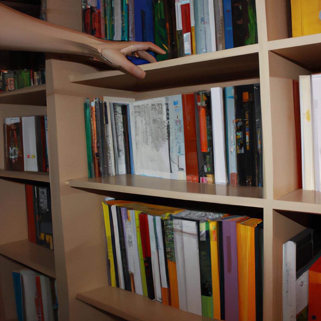
Books are not just about the words written inside; they are also visual objects that require thoughtful design. Whitespace can be used to create margins around text blocks, providing readers with comfortable reading experiences. By incorporating generous amounts of whitespace between paragraphs and chapters, designers can enhance readability and make the overall design more inviting. Additionally, whitespace can be strategically placed around images or illustrations to give them room to breathe and stand out on the page.
In curating exhibitions or displaying artworks in galleries, whitespace is essential for creating visual impact. By spacing out individual pieces on walls or pedestals, curators can allow each artwork to shine independently while still being part of a cohesive whole. The negative space surrounding each piece helps draw attention to its unique qualities and creates a pleasant viewing experience for visitors.
When it comes to layout design, whitespace is crucial for organizing information effectively. By leaving enough empty space between different sections or elements within a layout, designers can help users navigate through content more easily. Whitespace acts as visual cues that separate distinct areas and guide users’ eyes from one point to another. This improves user experience by reducing cognitive load and allowing for better comprehension of the information presented.
In conclusion, whitespace is far from being empty or wasted space in design; instead, it is a powerful tool that enhances visual compositions in books, curates, and layouts. Its strategic use improves readability, provides breathing room for viewers’ eyes, guides attention, and creates balance within designs. So next time you embark on a design project, remember to embrace the power of whitespace and let it transform your creations into visually stunning and effective designs.
The Importance of Whitespace in Design
Whitespace, also known as negative space, refers to the empty areas within a design composition that are intentionally left blank. It is not merely an absence of content but rather a powerful tool that designers utilize to enhance visual appeal and communicate effectively with their audience. By strategically incorporating whitespace into designs, designers can create balance, improve readability, and guide the viewer’s attention.
To illustrate the significance of whitespace in design, consider the example of a website homepage. A cluttered homepage filled with text, images, and graphics can overwhelm visitors and make it difficult for them to find relevant information. However, by skillfully implementing whitespace between different elements such as headings, paragraphs, buttons, and images, designers can improve user experience and facilitate easy navigation. The judicious use of whitespace helps prioritize content and makes important information stand out.
When discussing the impact of whitespace on design aesthetics and communication effectiveness, several key points should be considered:
- Enhanced Focus: Whitespace directs viewers’ attention to specific elements or messages within a design. Just like a spotlight on a stage highlights the main actor while dimming everything else around it, effective use of whitespace allows certain elements to take center stage while reducing distractions.
- Improved Readability: Ample spacing between lines of text improves legibility by preventing overcrowding. Additionally, sufficient margins provide breathing room for readers’ eyes and contribute to easier absorption of textual content.
- Emotional Appeal: Whitespace creates an aesthetic appeal that evokes emotions such as tranquility or sophistication. Its minimalist nature often gives off an impression of elegance or simplicity which resonates with viewers on a subconscious level.
- Visual Hierarchy: Employing varying degrees of whitespace helps establish visual hierarchy within a layout. Through careful placement and sizing choices concerning elements and white spaces alike enables designers to convey importance levels visually.
In conclusion (avoid using “in conclusion” explicitly), understanding how to effectively utilize whitespace is crucial in design. By skillfully incorporating negative space, designers can create visually appealing and highly functional designs that engage and communicate with the audience more effectively. The subsequent section will delve into the concept of utilizing negative space for visual impact, further exploring its applications and techniques.
Utilizing Negative Space for Visual Impact
Building upon the understanding of whitespace’s significance in design, let us take a closer look at how negative space can be effectively utilized to create visual impact. By strategically incorporating empty areas into a layout, designers are able to guide viewers’ attention and enhance the overall aesthetic appeal.
Negative space, commonly known as whitespace, refers to the intentionally left blank areas within a design composition. When used thoughtfully, it not only provides breathing room but also plays an active role in directing focus towards key elements. A compelling example is Apple’s advertising campaign for its iPhone X. The minimalist approach adopted by Apple allowed ample whitespace around the product image, drawing attention solely to the phone itself and enhancing its sleek design.
To fully leverage negative space for visual impact, consider these essential techniques:
- Contrast: By placing contrasting elements next to each other with sufficient whitespace between them, designers can emphasize the differences and make both elements stand out.
- Balance: Achieving balance through strategic use of negative space helps maintain harmony within a design while preventing overcrowding or confusion.
- Emphasis: Highlighting specific content or objects by surrounding them with generous amounts of whitespace draws immediate attention and adds emphasis.
- Simplicity: Simplifying a design by removing unnecessary elements and utilizing whitespace brings clarity and elegance to the overall composition.
Table: Emotional Response Elicited by Utilizing Negative Space
| Positive Aspects | Emotional Response |
|---|---|
| Cleanliness | Calmness |
| Sophistication | Elegance |
| Focus | Clarity |
| Minimalism | Simplicity |
By skillfully implementing these techniques, designers can evoke emotional responses from their audience. The utilization of whitespace allows for cleaner layouts that create a sense of calmness and sophistication. Moreover, focusing on essential elements enhances clarity and simplicity in designs.
With an understanding of how negative space impacts visual impact, we can now explore the concept of creating a balanced composition with whitespace.
Creating a Balanced Composition with Whitespace
In the realm of design, negative space or whitespace is often an underappreciated element. It refers to the empty areas surrounding and between visual elements in a layout, whether it be within a book page, curated exhibition, or graphic design composition. By consciously utilizing negative space, designers can create impactful visuals that captivate their audience.
To illustrate this concept, let us consider the case study of a book cover design. Imagine a novel set in a bustling cityscape. The designer chooses to use negative space by leaving large portions of the cover blank, creating an impression of vastness and solitude amidst the urban chaos. This deliberate absence draws attention to the lone figure placed strategically within the frame, highlighting its significance and forming a strong visual focal point.
When effectively employed, negative space offers several benefits that contribute to visual impact:
- Emphasis: By isolating key elements through ample whitespace, designers can direct viewers’ attention towards those components.
- Clarity: Whitespace aids in organizing information and improving readability by allowing individual elements to breathe and stand out.
- Simplicity: A minimalist approach achieved through judicious use of negative space brings elegance and sophistication to designs.
- Emotional response: Whitespace has the power to evoke emotions such as tranquility, serenity, or even isolation when used thoughtfully.
Table 1 below demonstrates how various design compositions with differing amounts of whitespace elicit distinct emotional responses:
| Composition | Amount of Whitespace | Emotional Response |
|---|---|---|
| Crowded | Limited | Overwhelmed |
| Balanced | Moderate | Calm |
| Minimalist | Abundant | Serene |
By leveraging these emotional triggers associated with different levels of whitespace, designers can intentionally shape viewers’ experiences and enhance engagement with their creations.
Whitespace serves not only as a tool for visual impact but also as a means to enhance readability. In the subsequent section, we will explore how whitespace can be strategically employed to improve legibility and create an optimal reading experience.
[Transition Sentence] Understanding the importance of whitespace in design leads us to delve into its role as a tool for enhancing readability.
Whitespace as a Tool for Enhancing Readability
Creating a Harmonious Design with Whitespace
In the previous section, we explored how whitespace can be utilized to achieve a balanced composition. Now, let us delve deeper into the role of whitespace as a tool for enhancing readability and guiding user experience.
Imagine you are browsing through an online magazine article that is densely packed with text and images. The lack of sufficient whitespace between paragraphs, headings, and images makes it overwhelming to absorb the content effectively. However, consider another scenario where ample whitespace is strategically incorporated throughout the layout. This generous use of whitespace allows your eyes to breathe and navigate smoothly from one element to another, improving both legibility and comprehension.
To better understand the impact of whitespace in design, let’s examine its benefits:
- Improved Focus: By providing enough empty space around important elements such as headlines or call-to-action buttons, designers can direct users’ attention precisely where they want it.
- Enhanced Organization: Whitespace acts as a visual separator, enabling designers to group related elements together while maintaining clarity and preventing visual clutter.
- Heightened Emotional Response: When used intentionally, whitespace has the power to evoke emotions by creating contrast or emphasizing certain elements within a design. It can invoke feelings of elegance, sophistication, or even playfulness depending on the context.
- Optimized User Experience: Well-utilized whitespace improves usability by allowing users to easily scan content and comprehend information quickly without feeling overwhelmed.
To illustrate these benefits further, consider the following table showcasing two different website layouts: one lacking appropriate whitespace utilization (Layout A) and another thoughtfully incorporating adequate whitespace (Layout B).
| Layout A | Layout B | |
|---|---|---|
| Text | Dense paragraphs hinder reading flow | Sufficient spacing enhances readability |
| Images | Overlapping visuals create confusion | Clear separation reduces cognitive load |
| Call-to-action | Cluttered elements distract from the main objective | Strategic placement guides user’s attention |
| Navigation | Crowded menu items cause navigation difficulties | Well-spaced links facilitate easy exploration |
As we can see in this comparison, whitespace plays a crucial role in creating an aesthetically pleasing and user-friendly design. Next, let us explore how whitespace contributes to the overall aesthetic appeal and user experience.
Transitioning into the next section about “Whitespace: Aesthetic Appeal and User Experience,” we begin to unravel another layer of understanding regarding whitespace’s impact on design principles and its ability to captivate users with visually appealing layouts.
Whitespace: Aesthetic Appeal and User Experience
In the previous section, we explored how whitespace can enhance readability in design. Now, let’s delve into another important aspect of whitespace: its role in creating aesthetic appeal and improving user experience.
To illustrate this point, consider a hypothetical scenario where a designer is tasked with creating an e-commerce website for a luxury fashion brand. The goal is to provide users with an elegant and visually appealing shopping experience that reflects the brand’s high-end image. By strategically incorporating whitespace throughout the website, the designer can achieve this objective.
One way whitespace contributes to aesthetic appeal is by providing visual breathing room. When used effectively, it allows elements on the page to stand out and be easily digestible for users. For instance, placing product images against ample white space draws attention to their intricate details and craftsmanship. This creates a sense of luxury and exclusivity, enhancing the overall user perception of the brand.
Moreover, whitespace plays a crucial role in improving user experience by making content more scannable and navigable. It helps establish clear visual hierarchies within layouts, allowing users to quickly identify key information or calls-to-action. By using generous amounts of whitespace between sections or paragraphs, designers guide users through the content flow effortlessly, reducing cognitive load and increasing engagement.
To further emphasize the importance of whitespace in design, here are four benefits it brings:
- Enhanced focus: Whitespace directs attention to specific elements on a page.
- Improved legibility: Ample spacing between text lines improves readability.
- Increased comprehension: Clear separation of content aids understanding.
- Elevated emotional response: Well-executed use of whitespace evokes feelings of sophistication and elegance.
Additionally, let’s examine these benefits in relation to three common web design elements:
| Web Design Element | Benefits |
|---|---|
| Navigation Menu | – Easy identification- Simplified decision-making process- Intuitive browsing |
| Call-to-Action | – Increased click-through rates- Clear and compelling messaging- Enhanced conversion |
| Image Galleries | – Highlighted visual impact- Improved focus on individual images- Streamlined viewing experience |
By incorporating whitespace strategically, designers can elevate aesthetic appeal and improve user experience.
Whitespace Techniques for Effective Communication
Building on the concept of whitespace’s aesthetic appeal and its impact on user experience, this section delves into practical techniques for utilizing whitespace effectively in design. By employing these techniques, designers can enhance communication and create visually appealing layouts that engage users.
Techniques for Effective Use of Whitespace:
-
Visual Hierarchy:
- Establishing a clear visual hierarchy is essential to guide users’ attention and prioritize information.
- Utilize larger amounts of whitespace around important elements or key content to emphasize their significance.
- Arrange elements based on importance, using size, color, or typography to differentiate between different levels of information.
-
Balance and Proportion:
- Achieving balance within a layout involves distributing whitespace evenly across the design.
- Apply the rule of thirds by dividing the layout horizontally and vertically into grids, ensuring each grid contains an appropriate amount of content and whitespace.
- Maintain consistent proportions throughout the design by considering both positive space (content) and negative space (whitespace).
-
Clarity through Contrast:
- Using contrast effectively helps highlight important elements while maintaining a clean and organized appearance.
- Create contrast by placing dark elements against light backgrounds or vice versa.
- Ensure there is sufficient contrast between text colors and background colors for legibility.
Example Scenario:
Consider a website homepage where a company wants to promote its latest product release. By employing effective use of whitespace techniques, such as establishing a clear visual hierarchy with ample spacing around key features, they can draw attention to specific aspects like product images or call-to-action buttons. This will provide users with a more engaging experience while navigating the site.
- Increased clarity in design
- Enhanced readability
- Improved overall aesthetics
- Greater focus on important content
Table showcasing examples:
| Element | Before | After |
|---|---|---|
| Headings | Crowded | Well-spaced |
| Paragraphs | Dense | Airy |
| Images | Cluttered | Distinct |
| Buttons | Overlapping | Prominent |
Incorporating these whitespace techniques into design layouts results in a visually pleasing and user-friendly experience. By employing visual hierarchy, balance and proportion, as well as clarity through contrast, designers can effectively communicate information while evoking an emotional response from users. Through strategic use of whitespace, designs become more engaging and memorable without the need for excessive clutter or overwhelming visuals.
Note: It is important to remember that effective use of whitespace should be tailored to individual design goals and target audiences. Experimentation and testing may be necessary to find the perfect balance between content and empty space within a specific context.
Comments are closed.